However, this move also signals that Facebook is moving away from tabs — which have been a popular tool for many Facebook marketers to draw attention to contests as well as get users to visit other entities such as an Instagram feed or website. Page admins can still draw users to the company website, a contest, or anything else, but it’s becoming clear that this will have to be done through News Feed posts and not direct visits to a page’s timeline.
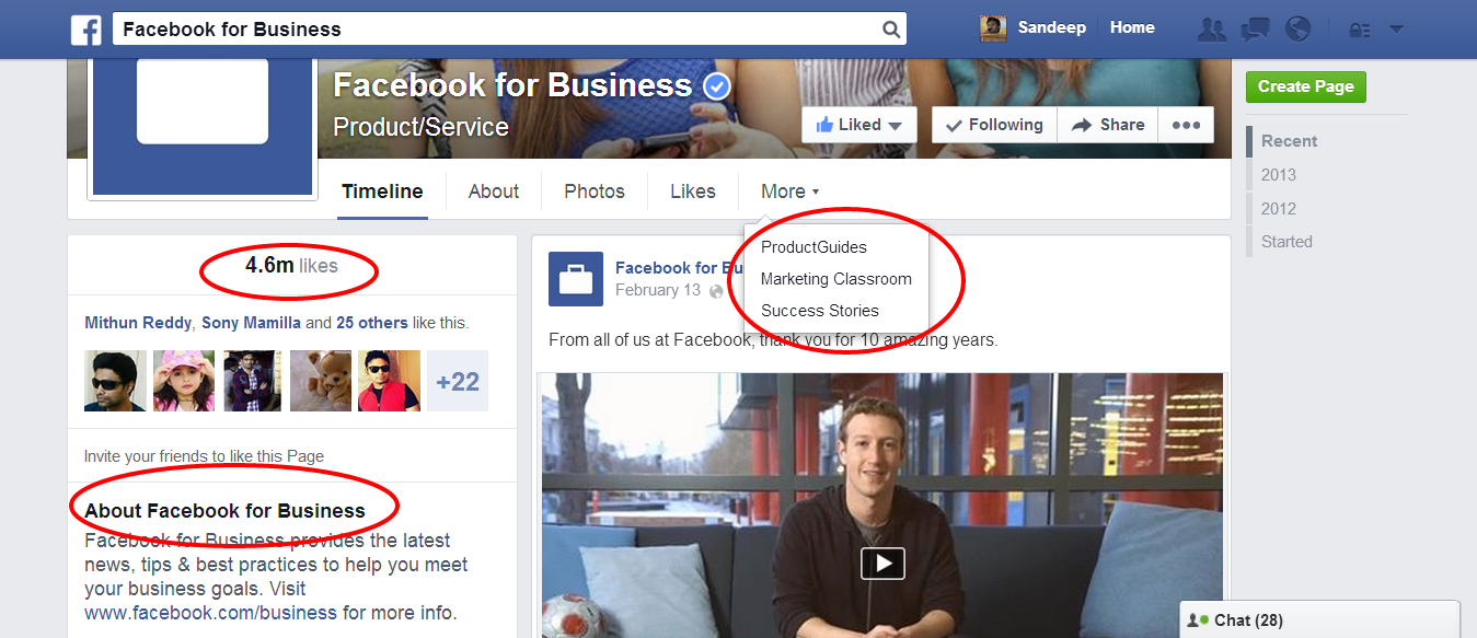
When many page admins and marketers saw the new design, they wondered, “Where did the tabs go?”
Tabs will still be supported, but they will be tucked into the “More” module and without images. Here’s a preview:

It’s not a malicious move to get more ad revenue; it’s Facebook trying to get pages to post better content and calls to action in the News Feed, where fans eyeballs are most likely to be.
However, Facebook PMD Woobox doesn’t think this is a death knell for tabs. In a recent blog post, the company gave their take on how marketers can still use Facebook tabs in light of this redesign:
Page Admins are concerned that their page tabs will no longer be relevant, and won’t be visible to their fans. However, when you look at a side-by-side comparison, you will notice that the new tab links are much closer in proximity to the News Feed – the old timeline had a whole lot of real estate between page tabs and page posts, which is where engagement occurs. The new layout places the tab links directly above the News Feed and the simple, non-cluttered layout grabs your attention!
Readers: What do you think this will mean for tabs on Facebook pages?


